
I Prompted AI Differently – and It Changed the Way I Build Training
This image didn’t just fill a page. It anchored the learner’s journey. Free prompt pack included.


I was building a workbook for a three-and-a-half-day training experience.
The audience? Sales representatives who were expected to go from zero to confident in record time.
This workbook was their first learning artifact. The thing they’d carry around, mark up, and refer back to as they grew into their roles. It wasn’t just a handout. It was an anchor.
And I knew I didn’t want to lead with the usual visuals:
Some stock image of a corporate building
Three corporate avatars high-fiving in a conference room
The kind of “diverse team” that really just means one guy with glasses and different skin tones
It didn’t fit. It didn’t say anything.
The Actual Ask: Build a Visual Identity That Fits the Content
On top of developing the training content, there needed to be a visual identity for the workbook that was going to be a part of that learning experience. This particular request wasn’t about aesthetics. No one said “make it pop” or “find something engaging.” What they needed was a visual identity that made sense alongside the content; something cohesive, grounded, and usable across a 4-day instructor-led training experience.
And here’s the thing: the content itself was technical. Dense, even. The kind that can easily overwhelm learners if there’s no emotional or structural relief built in.
So we built in structure.
The training was broken into phases, and each phase followed a storyline.
The visual narrative followed that same arc:
Start with collaboration and alignment (teamwork imagery)
Then progress toward challenge and discovery (mountains, hiking, kayaking, etc., depending on the section)
And finally, reach a point of confidence and clarity, but not finality.
It wasn’t just a theme for the sake of theme. The imagery helped hold emotional continuity across modules.
So the ask wasn’t “find a good-looking image.”
It was: create something that supports the pace and tone of this experience, even before the first word gets read.
I had the color palette. I had the content.
What I didn’t have was an image that captured any of that, until I started prompting.
The Prompting Begins
I didn’t use ChatGPT to write the prompts for me. I wrote them myself.
That’s the part that matters. The image only works if the thinking behind it is clear.
AI doesn’t generate good visuals on its own. It reflects what you tell it, and most people don’t actually know what they’re trying to see. That’s why the results look vague or forced.
Before I even touched DALL·E, I knew:
Who the learners were
What kind of pressure they were under
What the emotional tone of the training was
What colors we needed to use
And what moment this image needed to reflect; one of readiness, not arrival
That clarity became my prompt.
And then I rewrote it. Four times.
Each revision got me closer to what I needed, not because the AI got better; but because I did.
Prompt Evolution: From Literal to Lived-In
This wasn’t about depicting a literal workplace. It was about evoking a journey, something that felt more like a climb than a class. The imagery needed to support that metaphor.
Here’s how it unfolded:
🟡 Prompt 1 – The Generic Starting Point
“Please generate an image of a group of people who are hiking and they are at the top of the mountain. It's a sunset, so they're looking at the horizon. The image has to be in color, but the characters and the image itself needs to look like it was a sketch, not realistic.”
This gave me the kind of image that fits into any generic deck: technically fine, emotionally flat. The people looked to the horizon, vaguely cheerful, and completely disconnected from the idea of effort or learning. Just looking to the horizon. Blah.
🟠 Prompt 2 – Introducing Motion
“Group of four people outdoors, diverse in age and appearance, walking uphill together. The image has to be in color, but the characters and the image itself needs to look like it was a soft digital illustration. The tone is intentional but not dramatic.”
Here, I started nudging toward metaphor, something that suggested momentum. The image didn’t need to scream “journey,” but it needed to hint at it. This one was a little more dynamic, but it still felt a bit generic.

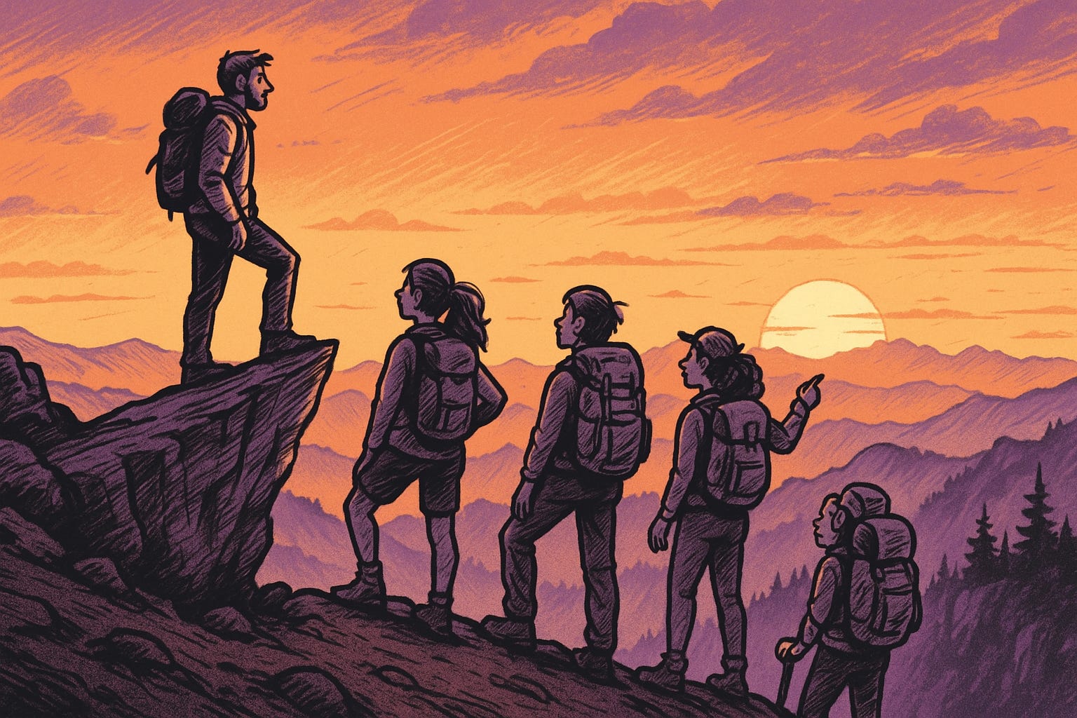
🔵 Prompt 3 – Final Image with Emotional Precision
“Illustration of four individuals (different genders, ethnicities) pausing at a lookout point mid-climb. They’re not smiling, they’re thinking and looking at the horizon. Please use variations of the following color palette: (I added organization’s palette HEX codes). The feeling is: we’ve come far, and we know there’s more ahead. Leave some white space in the sky area to allow for text.”
This is the one I used in the workbook.
It didn’t look like “success.” It looked like a midpoint. Like catching a breath.
That’s what the learners needed to feel as they were completing the training.

What I Took Away
This wasn’t about finding a cool image. It was about figuring out what role that image played.
The workbook wasn’t just a printed document, it was part of a sequence, and part of a narrative arc that the training was designed around. Every element in it had a purpose. The image on the cover had to hold the emotional tone of the moment, not summarize the whole experience.
And the only reason the image worked was because I took the time to ask better questions.
Not “What should this look like?” But:
What point in their journey is this?
What should the learner feel right now?
What visual tone makes sense for this kind of pressure?
That’s why the final result wasn’t just good, it was aligned.
And the learners noticed! One facilitator said the workbook felt “serious, but thoughtful.” Music to my ears.
That’s the result of doing this work with care.
Want to Try It?
I put together a free resource with 5 prompts you can copy, paste, and adapt to improve the visual identity of your training materials, specifically for instructor-led or hybrid settings.
These aren’t just templates. Each one is tied to a real instructional moment:
A workbook cover
A title slide
A section divider
A job aid
A final wrap-up or reflection point
Here are two of the prompts from the pack:
📘 Workbook Cover Prompt
Create an illustrated image that reflects the opening moment of a training session focused on [insert topic or audience, e.g., technical, early-career sales, etc.]. The image should visually represent a sense of [insert tone, e.g., grounded confidence, preparation, curiosity] as learners begin a [insert duration, e.g., 3-day onboarding] journey. Include subtle cues of [insert metaphor or concept, e.g., teamwork, navigation, learning as a journey]. Use a soft visual style and avoid corporate gloss. Apply a color palette based on: [insert brand hex codes or brand tones]. No text or logos. This is for the cover page of a physical workbook.
🛠 Job Aid Prompt
Design an image for a printed job aid that supports on-the-job reference for [insert role, task, or environment]. The tone should be [insert tone, e.g., task-oriented, clear, no-nonsense], supporting quick lookup or guidance. Depict a realistic, context-specific moment of someone engaging in the task (e.g., checking a device, referencing a tablet, communicating with a team member). Avoid artificial poses or overly stylized settings. Stick to this color palette: [insert brand hex color codes]. Keep it neutral and focused.
Note: These prompts are designed for creative experimentation and instructional ideation. As with all GenAI-generated content, users are responsible for reviewing copyright, licensing, and brand alignment based on their platform and use case.
Want the full set of five prompts formatted, downloadable, and ready to use and keep in your toolbox?
👉 Grab the free prompt pack on Gumroad
Before You Go
If you’re building a startup or early-stage team and haven’t yet laid the foundation for repeatable onboarding and learning, I’ve been thinking a lot about that challenge; and building tools to help. Whether it’s an onboarding hub, a training audit framework, or a few clear SOP templates, I focus on helping fast-moving teams protect both their talent and their momentum.
You can explore my Notion onboarding kit (below) or check out the tools I’ve been designing for teams who need structure before they scale.
Note: Everything I publish reflects my own perspective—rooted in past experience and personal research. Nothing here represents any employer or client.